EMERGENCY EVACUATION GUIDELINES
Tuesday, March 28, 2023
Tuesday, March 21, 2023
Sunday, March 19, 2023
Google Sites Page Design Tips
When designing your Google Sites pages don't forget the small things. Before and After. Do you see the differences?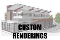
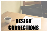
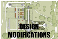
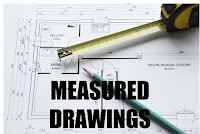
The changes are as follows.
1. Color change of the text.
When viewing the site page, the darker text is a distraction.
2. Location of the text.
Change the text from lower middle to center middle of the images. The first image drafts the text covered the dropdown arrow of the link to the specific pages.
3. Text design change.
Adding a text shadow makes the text readability much better.
4. Image size or the canvas size of the entire image the text will be placed on.
The first images are not square, square images fit and work better for many web page designs and layouts.
This a Google Sites design.
Subscribe to:
Posts (Atom)
Disclosure
As an Affiliate Marketer, I earn from qualifying purchases. If you click a product affiliate link on Concept Architectural Designs and make a purchase, I may receive a commission at no additional cost to you!



.png)
.png)
.png)

.png)
.png)
.png)

.png)
.png)
.png)
.png)